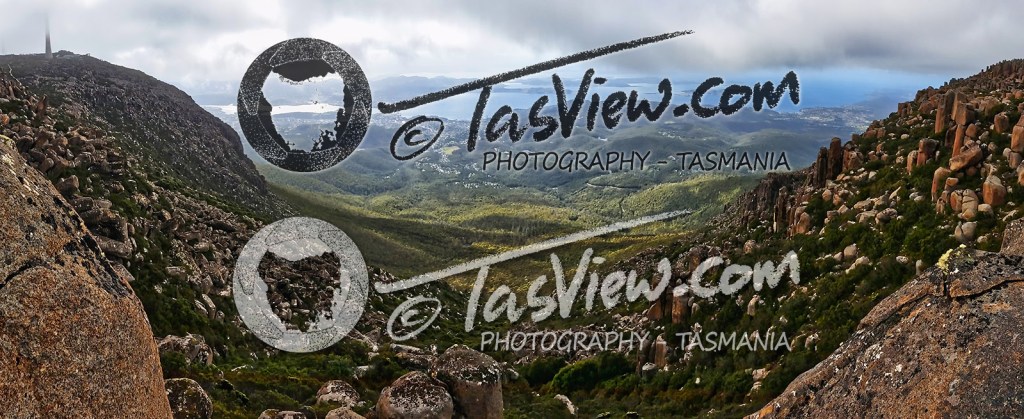
Not entirely happy with a generic font for my watermark, I’ve spent a few hours making this hand-written logo which is much more original and personal. Below shows two versions for light and dark backgrounds.

Like looking through a lens to capture Tassie, the Tasmania map is circled by aperture leaves which I photographed from an old 50mm 1:1.8 Olympus Film lens and edited to match the text. I had this idea for the original Tasview logo a few years ago which ended up becoming props, a bit obscure and I don’t think was well executed – I’m not entirely sure if it translates well here.
I tried writing TasView with a texta first but it lacked control and not the effect I was after, so I switched to a 2B pencil and wrote it out – lets just say LOTS, before I was happy.
I may fiddle with this a bit more and try a version with the circle/map behind the text like my previous watermark but I think it may get lost or obscure the text.

It will appear on my images in a corner much smaller and subtler than shown here 🙂
I’ve also started playing with Luminar4! After using Photoshop CS6 for years, it’s quite a bit different. I’m mainly interested in how it handles noise reduction and sharpening, initial testing looks very promising. I’m finding it great for editing photos but lacks some things I use in photoshop and can be a little clumsy making fine adjustments but that may be because I am very new to it and have lots to learn still. More on that later perhaps 🙂